So nothing makes me happier than designing kitchens on Ikea's oft-maddening kitchen planner. Maddening, but so fun as you can see everything in 3D and twist the room all around. Excellent for sharing ideas with people who have a hard time visualizing your genius.
Remember we talked about my sister's terrible terrible kitchen? Here's the plan for fixing it.
First, the overview:
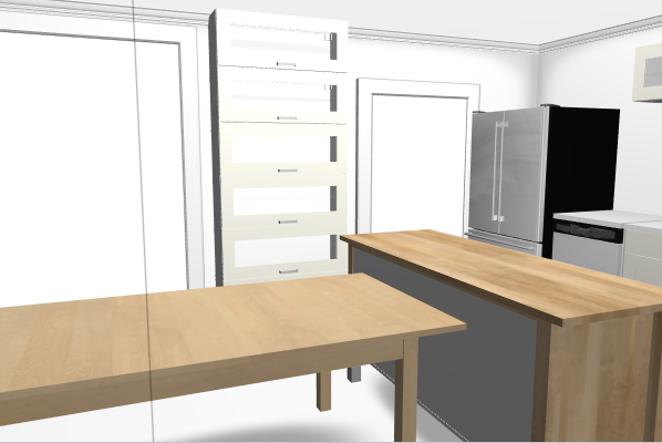
Sliding glass windows to the ... I think east? The kitchen and dining room are both small and cramped, but opened up are large(r) and lovely. We determined that she needs a table for entertaining, so the table (which will be custom built by our brother) will pull away from the island (also custom built... these are Ikea stand ins). But day to day, everyone can sidle up to the kitchen area to eat. So look through these photos, and don't get confused by the different color cabinets.. I tried them out in both white and gray. She liked gray in the showroom.
The image below is what the kitchen would look like if you were standing at approximately the sink.
Here's from the current dining area.
Flying overhead like the Flying Nun:
Standing at the stove, or walking in the sliding glass doors to the deck.
Standing in the living room ... you are seeing the back of the stacked horizontal cabinets here. What you will really see is wall.
This is if you are between the sliding glass doors.
From the dining table. Bring me mead, woman!
here I've switched over to gray cabinets. Note my continued resistance to traditional upper cabinets. They are the Buck Teeth of the kitchen, and I hate them.
We like the gray. That's a wall of cabinets on the back of the current dining room... longer term storage for the kitchen. We might even build in a little bar there.
If you were a raccoon living in the wall with Xray vision. Looking out over the sink.
Back to white cabinets. There's no rhyme or reason here.
Working at the island.
Mullions!
The end. Total cabinetry and appliance cost: under $10K for everything you see here. A wall between the kitchen and living room will have to come down, but that's nothing a sledge hammer can't fix.


No comments:
Post a Comment