 Alison, in portrait by extremely talented artist named Seth Haverkamp. (updated with his name!) He's totally brilliant - one of the best portrait artists in the country and is still in his 20s. See for yourself.
Louis
Observe.
The Living Room
The dining and entry
dining and living areas

 clean this mess up, Louis!
I like the floor-to-ceiling drapes and the windows. The chair isn't bad either.

excellent storage. hideous finish.

OK, that's what she has, and she sent me desperate notes for help.


And she found this picture on Apartment Therapy -- a great solution. She can keep her current chairs and slip cover them in white sheer fabric. It's easily done with an iron, seam-binding tape, some ribbons or seam tape, a pair of scissors (and about 3 yards of fabric for every two chairs).
Cut the fabric into 3 yard lengths, then cut it in half lengthwise to have two equal pieces. One piece will go with one chair. Lay the fabric over the chair. Fold the sides in and under until they are the right width for the chair. Pin. Remove, and use iron on seam tape as the instructions say on every unfinished edge. Drape the fabric over the chair again, pin where you want ribbon ties to go, remove, and tack the ribbons on with a glue gun or a few hand stitches. Now tie that slip cover on.

See? Neato.
But it might not be the best answer, because I really want that table to shine, and I'm afraid these chairs would compete. I love the rough top and I don't want all that diaphanousness to distract the eye.
She also toyed with covering the chairs in Saran Wrap and spray painting them (she can't paint them directly because they are government property) but I nixed that because it's totally insane.
She's also in the market for a couch, and is looking at these. I think she has already selected on but I am not sure which.
Nice, clean lines, and dark so the mud that Louis tracks in won't show. There is the matter of his blond hair all over everything, but we have to pick our battles. With some awesome graphic pillows -- she can order pillow covers online and have them airmailed -- the couches will be great. Jonathan Adler may have just the ticket.
http://pillowsandthrows.com/designer-pillows--jonathan-adler-pillows.html
She's talking about painting the walls a couple of different shades of blue -- darker in the entry, a little lighter on the wall behind the dining table, and lighter in the living area. I like this approach, but suggest going about it this way: get a paint chip that has several levels of intensity of the same shade (that's most of them -- they go from lightest on top to darkest on bottom) and select three. I like Benjamin Moore's Santa Clara, How Blue Am I and Seabrook -- greeny blues. (She wants blue).
http://www.buyaurapaint.com/753-rwbt.html
http://www.buyaurapaint.com/752-rwbt.html
http://www.buyaurapaint.com/750-rwbt.html
And I think she needs to do something around the door leading to the bedroom -- there's no molding and it just looks kind of unfinished. So perhaps a graphic stencil running all the way around the door? It could be repeated in some other corners... Here's one stencil i like.

And here (below) is a stenciled tent -- its sort of what I have in mind, only I would want her to take it down about 40 notches (and apply it vertically).

I also found this picture and thought it would be cool -- especially for temporary digs like these.
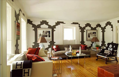
A great big graphic statement all the way around ... it becomes the decoration. Imagine it in white on a blue background...


Thank you, Pam! I got the brown couch. Any thoughts on replacement light fixtures? It's hard to tell in the pictures, but the one in the bedroom is particularly offensive.
ReplyDeleteI would have cleaned up a little before taking photos if I'd known it would be going on the internets!
The lighting is indeed awful -- luckily its easily replaced. Consider something from Ikea -- maybe one of the large paper lanterns. Easy for a friend to send you! I don't know what's available down in Panama-way. You can also look at lightology.com and lampsplus...
ReplyDelete